
CLIENT: CRYOGEN INDUSTRIAL SERVICES
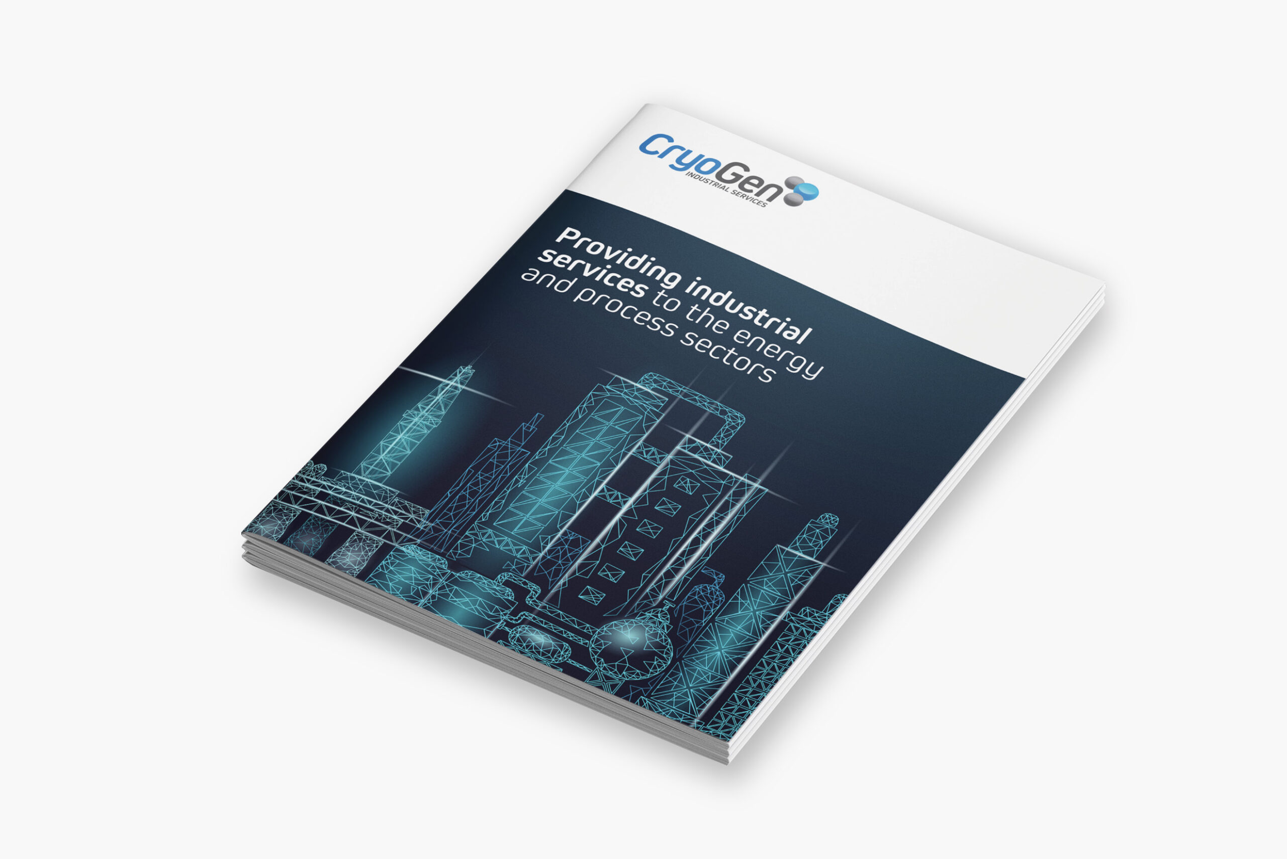
Dry ice cleaning, with a sharper look
After designing the new Cryogen brand, the next phase of the project was to bring that identity to life in a tangible way – starting with a printed company folder. This folder needed to serve multiple purposes: something professional and informative that could be sent out to existing clients, a way to introduce the brand to new prospects, and a standout giveaway for national trade shows and networking events.
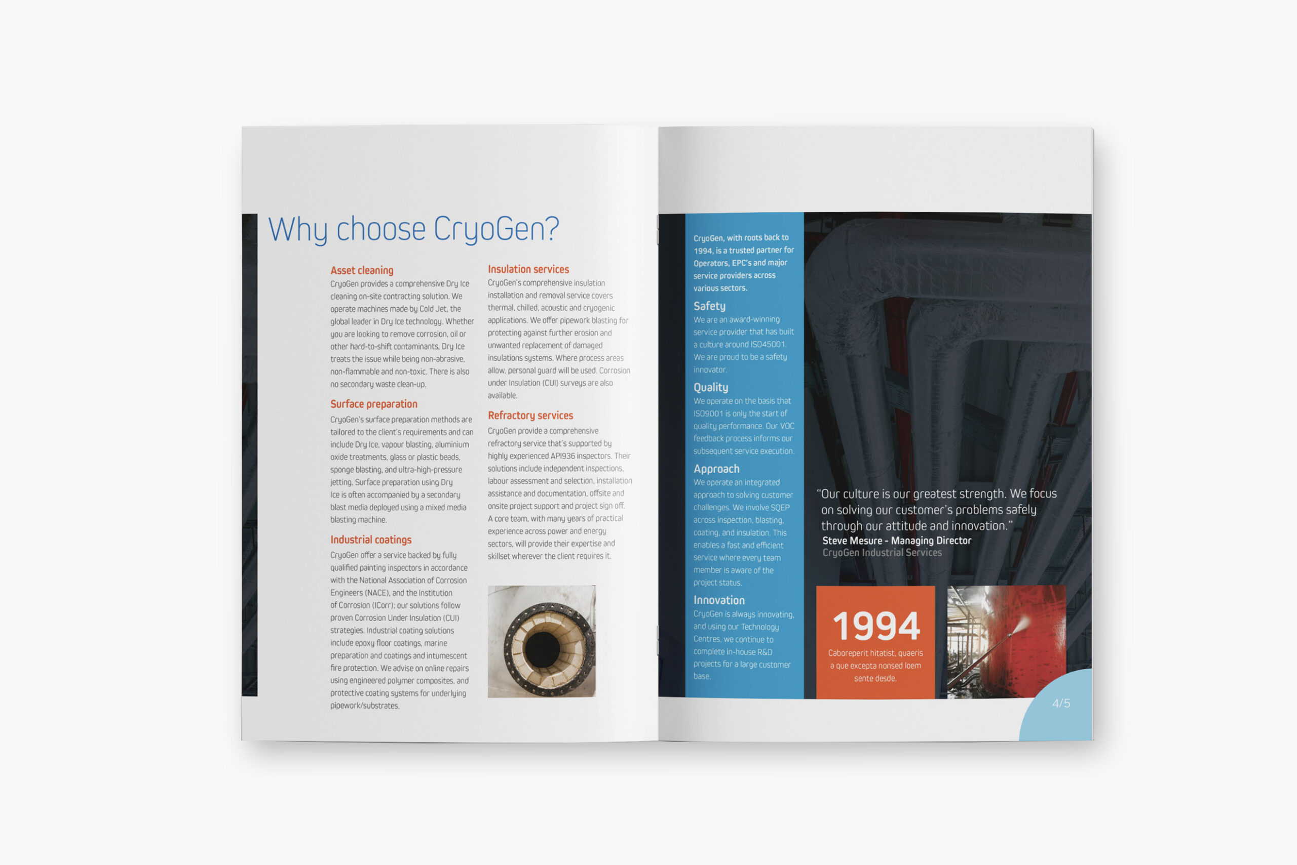
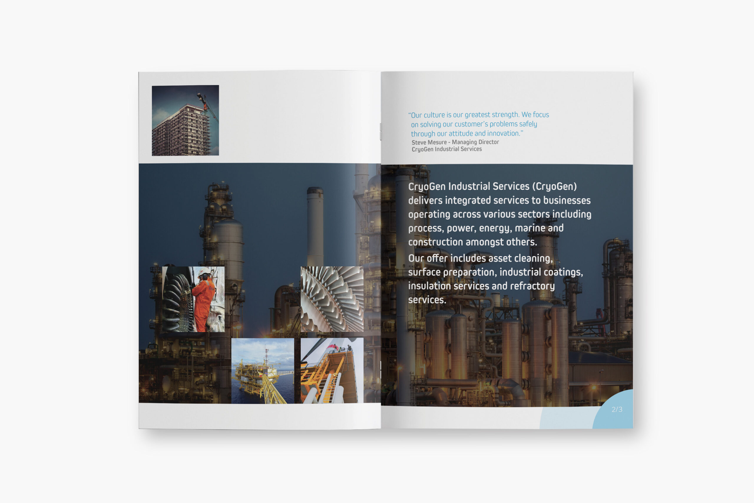
At the heart of the folder was a 32-page brochure designed to showcase Cryogen’s full range of services in a clear and compelling way. It included detailed service descriptions, background on key personnel, and an overview of the company’s in-house training programmes. Every page was crafted to reflect the new brand look and feel – clean, confident, and trustworthy—making sure the first impression was a strong one, whether someone picked it up at an event or received it in the mail.